
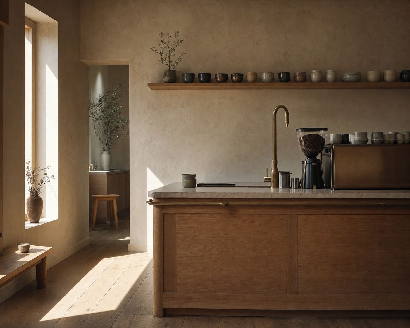

The door closes behind you, and for a moment the street is still on your shoulders. Then the room takes over. In a small cafe, that handoff happens quickly. Within a step or two you can see the counter, a menu at reading height, and the person who will take your order. You do not need to search for where to go, and you do not need to ask. Some part of you settles. The whole room hasn’t explained itself yet, though. Past the end of the counter, a window seat catches the afternoon light. A run of shelving holds something you can’t quite make out from the door: a stack of plates, a row of bottles, a joint in the timber that seems to have been worked by hand. You’ll notice it properly later, when your coffee is in front of you and you have a reason to look up. That gap, between what the room shows you right away and what it lets you find later, is where I want to start. It is a small distinction, and it holds most of what I believe about designing small rooms. I visited Little Owl Coffee and stayed longer than most of the people around me. That difference, between the room you understand in a single step and the room that rewards a second look, is where I want to begin.
Showing Enough, Not Everything
I have always been drawn to rooms between roughly five hundred and seventeen hundred square feet. Part of that is preference, and I want to say so plainly. I enjoy concentrated spaces and selective material relationships. I like a room where every element has to earn its place. But preference isn’t an argument, and a small room shouldn’t be designed around the designer’s pleasure. What scale does offer, I think, is a different kind of attention. In a larger room, circulation, material, atmosphere, and daily use can drift apart and be solved one at a time. In a small room they can’t. The path to the counter is also the view of the shelving. The shelving is also storage, and the storage is also where a barista reaches forty times before noon. When a decision moves one of these, it moves the others. That is why I’m wary of a familiar way of describing design: first you plan the room so it functions, then you decorate it so it has atmosphere. In a small room, atmosphere doesn’t arrive at the end. It comes from how those decisions relate to each other, and from the client’s understanding of the people they serve. My original draft for this essay put the first intention simply: we want to position others to be successful when they first step in the door. Then it asked the room to unfold unexpectedly through considered details. At first those two ideas can sound like they’re pulling in opposite directions, one toward clarity and the other toward withholding. The threshold is where they have to be reconciled.

What a Good-Looking Room Can Hide
It is easy to judge a room by whether it looks resolved: a balanced elevation, a cohesive palette, a photograph that holds together. Those things matter. They can also hide the questions that decide whether the room works. Does a first-time guest feel comfortable coming in, or do they hover at the door working out the rules? Can staff do their jobs without stepping around the design? Does the room’s character belong to the owner, or only to the rendering? The people who live with the answers are rarely the ones who approved the mood board. They are the guest who isn’t sure where the line starts. They are the server carrying three plates through a gap that looked generous on paper. They are the owner, two years in, wiping down a beautiful surface that marks every time someone sets a glass on it. Our specifications are meant to serve the people serving guests as well as the guests themselves. In a small room I don’t treat that as a secondary goal, because there’s nowhere else for the work to go. I saw how closely these questions sit together on a recent visit to a small Denver coffee bar. Its most striking element is a curved plaster wall with built-in, backlit shelving that holds the shop’s merchandise. The wall softens the room and gives a waiting guest something to look at. It also draws you along a path that ends short of the counter, so a product you find on the shelf sits apart from the place where you’d pay for it. That separation may well be deliberate, since it keeps merchandise from crowding the two people working the bar. From the guest’s side of the counter, though, I couldn’t tell which concern had led. A single gesture was doing the work of display, enclosure, and wayfinding at once, and each of those jobs asked something different of it.
Two Arrivals, One Room
An abstract argument only goes so far, so here is the same arrival designed two ways. The second version isn’t hypothetical. It describes Little Owl Coffee’s LoHi cafe in Denver, a 400-square-foot shop designed by Swan Dive Design Studio and opened in 2023 (Swan Dive Design Studio). It tests a clear client intention. The owners had spent nearly ten years refining the workflow at their original cafe, and they described the new bar as “functional… almost copy-paste,” with the materials changed (Daily Coffee News). The question the room answers is how a proven way of working can gain a new character without being asked to change.

Version A puts the service point directly on axis with the door. From the threshold you can see the counter, every seat, the back wall, and the restroom corridor. Nothing is hidden. A first-time guest knows at once where to go and whether there’s room for them. Staff can read the whole room from the counter, which makes greeting, clearing, and noticing someone waiting easier. When the service model changes, say from counter service to table service, or when a seating cluster has to be rearranged, the open plan takes it without complaint.What Version A complicates is the second visit, and the hour after the first one. Once everything is seen from the door, there isn’t much left to find. The room can feel exposed. A guest sitting at the back has the whole room looking at them, and the person at the counter is on display all day.
Version B keeps the service point just as legible. At Little Owl, the coffee bar runs parallel to the storefront, so the ordering point is clear as soon as you step inside, and the waiting position sits along a raised stone bar top where you can watch the baristas work. The staff route stays compact: two baristas work side by side, and the coffee station sits “no more than two steps from the POS system” (Mile High CRE). The rest of the room comes into view after you’ve ordered and turned around. A suspended copper lighting track draws a low canopy across the space, the curved shelving wall glows to one side, and the arched hallway at the back ends in an edge-lit frame. What Version B offers is a sequence: orient first, then discover. What it complicates is real. Staff lose some sightlines, and someone has to be responsible for the part of the room the counter can’t see. A guest standing at the door may hesitate, unsure whether there’s room inside. The composition that creates the reveal is also harder to rearrange. That return in the millwork is permanent in a way an open floor isn’t, and the discovery can be brief. At Little Owl, with a bar top for three and a couple of small tables along the storefront, the room rewards a second look while you wait, but it doesn’t ask you to stay once your coffee is ready. This makes context within the neighborhood more relevant as its location in the LoHi neighborhood is an area predominantly accommodating foot traffic and in a common pedestrian route to downtown Denver by way of the millennial bridge.
I don’t assume Version B is better. I think it can be better for a particular operator, in a particular setting, serving a particular guest. The comparison is useful because it makes that judgment visible, and lets the client and me argue about something concrete instead of something stylistic. Seeing Version B built taught me something the drawing alone hadn’t. Discovery and lingering are not the same thing. A room can unfold beautifully in the three or four minutes it takes to pull a shot, and that may be all its guests want from it.
Where the Client Changed the Plan
I wrote in the original draft that our work is a collaborative solution; after all, this is their space. I believe that. But collaboration that only shows up at the end, as a courtesy, doesn’t change much. It has to shape the plan. The owner knows things I can’t learn from a survey or a site visit: who comes in at seven in the morning and who comes in at nine at night, which regulars want to be greeted by name and which want to be left alone, what the staff complain about at the old location, and how the menu is likely to change in the first year. Little Owl is a clear example of what that knowledge can do, even though it isn’t our project. The decision that most shapes the LoHi room, the bar and how it works, came from the client, after a decade spent watching their own people work in a cafe of roughly 300 square feet (Daily Coffee News). The design’s task was to build character around a workflow that was already proven, without asking the baristas to work around it. It changed how I think about the first meeting with an owner. Before I ask what a room should feel like, I want to understand what their staff already know about how it should work.

This is also where I have to question my own conviction. When I’m drawn toward a more edited, more gradual arrival, I have to ask whether I’m responding to what this room needs or to my own attraction to a carefully edited interior. Restraint and gradual discovery are part of my sensibility. They aren’t automatically right for every owner, neighborhood, or service model. The client is often the one who tells me which is which.
When the Whole Room Should Show Itself
The strongest objection deserves a fair hearing: not every hospitality space benefits from gradual discovery. Some operators need immediate visibility, speed, and a simple transaction. A grab-and-go coffee window during a morning rush doesn’t need a reveal. It needs a clear line, a clear pickup point, and a clear way out. A first-time guest at a busy counter wants confidence more than curiosity. A layered arrival could cost exactly the clarity the room exists to provide. A highly composed plan could also become a liability when the service model changes, which in a young business it often does. I would deliberately favor a simpler, fully visible sequence in a few conditions: a room run by one or two people who need to see the door at all times; a counter that depends on high volume and quick turnover; and a tenant who expects the concept to change within a few years and needs a plan that can change with it. In those rooms, I would protect the threshold’s clarity first and resist anything that slows it down. Little Owl’s own lineage makes the point. The original shop on Blake Street was designed by Roth Sheppard Architects as a 380-square-foot cafe inspired by Italian stand-up coffee bars, with standing room for customers on the go (Roth Sheppard). For a guest like that, a short visit is not a shortcoming. It may be the whole brief. Taking the objection seriously doesn’t weaken the argument. It narrows it. The aim was never to hide things. It was to decide, with the client, what someone needs to understand right away and what can wait for them.
Questions Before the Palette
If I take this seriously, it changes the order of the work. Before refining a palette or pulling samples, I want to ask the owner:
- What should a first-time guest understand immediately?
- What would you like them to notice after they’ve settled in?
- How do you want to greet or serve them?
- Which staff task must the plan make easier?
- What might change after opening?
None of these are aesthetic questions, and every one of them will shape the aesthetic. The answer to the first decides what the threshold has to show. The answer to the second decides where a considered detail, such as a junction in the millwork or a change in material underfoot, will actually be seen. The answer to the fourth may decidethat the most important detail in the room is one no guest will ever notice.

Back at the Threshold
Go back to the door of that small cafe. The counter is still there, legible from the first step. The window seat and the shelving are still waiting past the end of it. But what looked like an attractive view should now read as a set of decisions about people: what a stranger needs to feel at ease, where a guest’s attention might go once they’ve sat down, the path someone behind the counter walks forty times before noon, and the owner’s sense of who comes through the door and why. The threshold is clear because someone decided what had to be understood right away. It holds something back because someone decided what could wait. Neither decision came from the palette. What interests me about the small room isn’t how much can fit into it. It’s how closely we can consider what belongs there: the first clear direction, the detail found while you wait, and the space someone needs to do their work. Its scale invites that attention. The client helps us decide where it should go, and how long a guest should be invited to stay.
